Your website is often the first impression potential customers have of your business. It’s a powerful tool that can communicate your brand identity, create a memorable user experience, and influence visitor behavior. One of the most important elements of web design that affects all of these aspects is your choice of color scheme. In this guide, we’ll walk you through the process of selecting the perfect colors for your website.
Conclusion: Choosing the right color scheme for your website is a crucial part of effective web design. It can influence user perceptions, emotions, and actions. By understanding your brand, considering your audience, and using color psychology, you can create a visually appealing and impactful website that effectively communicates your message and reinforces your brand identity.
At Mamba Technologies, we specialize in web design and development, including creating visually appealing websites with the right color schemes to captivate your audience. If you need assistance with your website design or have any questions about color schemes, feel free to contact us for expert guidance.
- Understand Your Brand:
- Consider Your Target Audience:
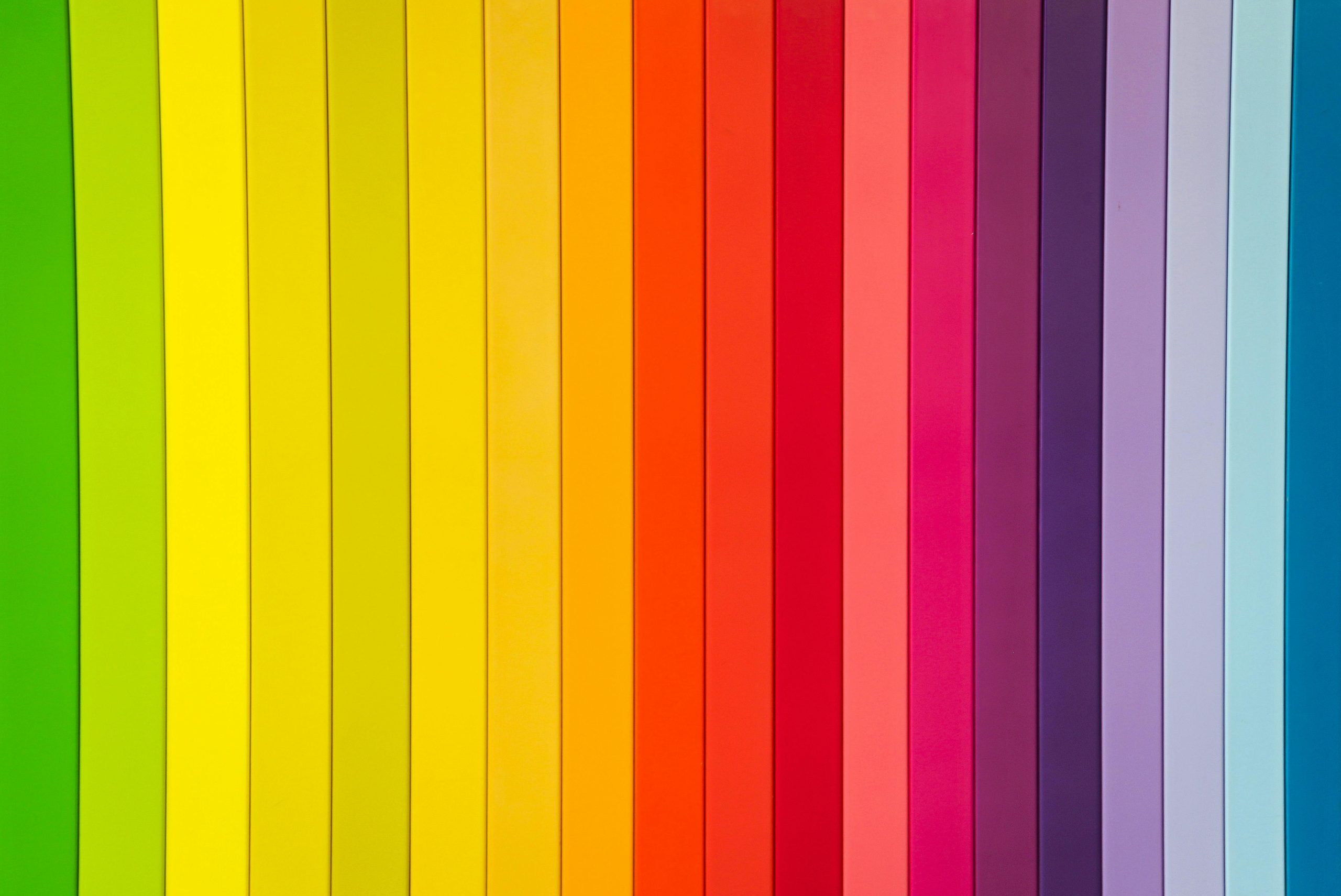
- Use Color Psychology:
- Blue: Trust, professionalism, calmness
- Red: Energy, excitement, urgency
- Green: Nature, growth, health
- Yellow: Optimism, warmth, positivity
- Black: Elegance, sophistication, mystery
- Limit Your Palette:
- Test for Accessibility:
- Test in Different Contexts:
- Get Feedback:
- Keep It Consistent:
Conclusion: Choosing the right color scheme for your website is a crucial part of effective web design. It can influence user perceptions, emotions, and actions. By understanding your brand, considering your audience, and using color psychology, you can create a visually appealing and impactful website that effectively communicates your message and reinforces your brand identity.
At Mamba Technologies, we specialize in web design and development, including creating visually appealing websites with the right color schemes to captivate your audience. If you need assistance with your website design or have any questions about color schemes, feel free to contact us for expert guidance.